
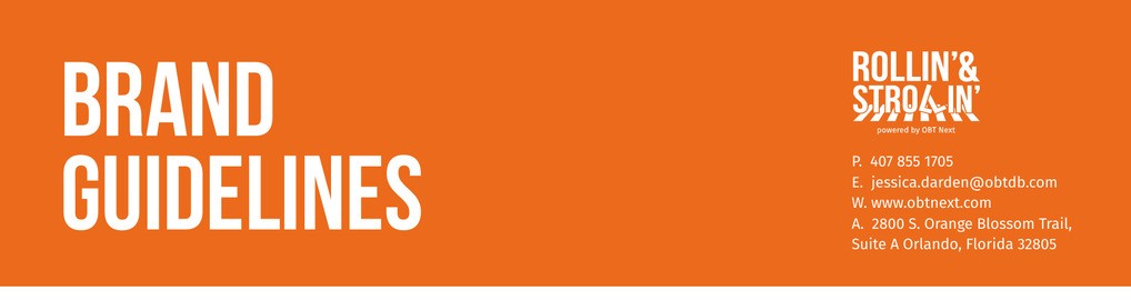
Give OBTNext's Rollin' & Strollin' safety initiative an identity the whole neighborhood can recognize, with guidelines that keep it consistent on every surface.
Rollin' & Strollin' is a community-driven initiative from OBTNext that promotes pedestrian and bicycle safety along Orlando's Orange Blossom Trail. It launched with a real job to do: teach kids and adults how to navigate their streets safely, and build a sense of unity while doing it.
The initiative needed a face. The mark had to carry four ideas at once: community, safety education, mobility, and local Florida identity. It also had to sit comfortably next to the existing OBT Next brand, because every application reads "powered by OBT Next." And it had to survive every surface a community campaign touches, from street signage and event tents to letterhead and social media.
We designed a wordmark that puts the message inside the letterforms. The crosswalk is built directly into "STROLLIN'," with stripes that double as the painted lines of a pedestrian crossing. You read the name and you see the street.
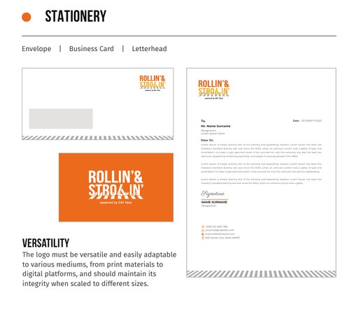
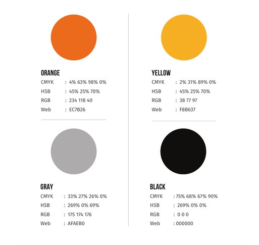
Around the logo we built the full system: an orange and yellow palette specced for print and web with CMYK, RGB, HSB, and hex values for every swatch, Bebas Neue and Fira Sans for type, four approved background variations, clearspace rules, and a stationery suite covering envelope, business card, and letterhead. All of it documented in a brand guidelines book any designer or printer can pick up and apply without guesswork.
OBTNext walked away with more than a logo. The guidelines made the brand self-serve: every banner, flyer, and post since has come out looking like the same initiative, whether or not we were in the room.
When Rollin' & Strollin' hit the streets for its first community event, the identity was ready. See how the brand showed up in the field in the companion case study, A Community's Stride.

Tell us what you're working on and we'll take it from there.