
Give the Orange Blossom Trail corridor a single identity that holds across three separate programs, with rules specific enough that fabricators, partner agencies, and staff all produce the same mark.
The Orange Blossom Trail corridor runs three programs under one authority: the CRA, the MSTU, and the SNP. Each has its own mandate, its own budget line, and its own reason to put its name on something. Left alone, that becomes three brands on one street.
The risk is not cosmetic. When a corridor sign, a grant flyer, and a partner agency lockup all look like they came from different organizations, residents stop reading them as one effort. Coordinated public investment starts to look scattered.
We presented three candidate directions. The board selected the one we called Milepost Stack, and we built the full system from it.
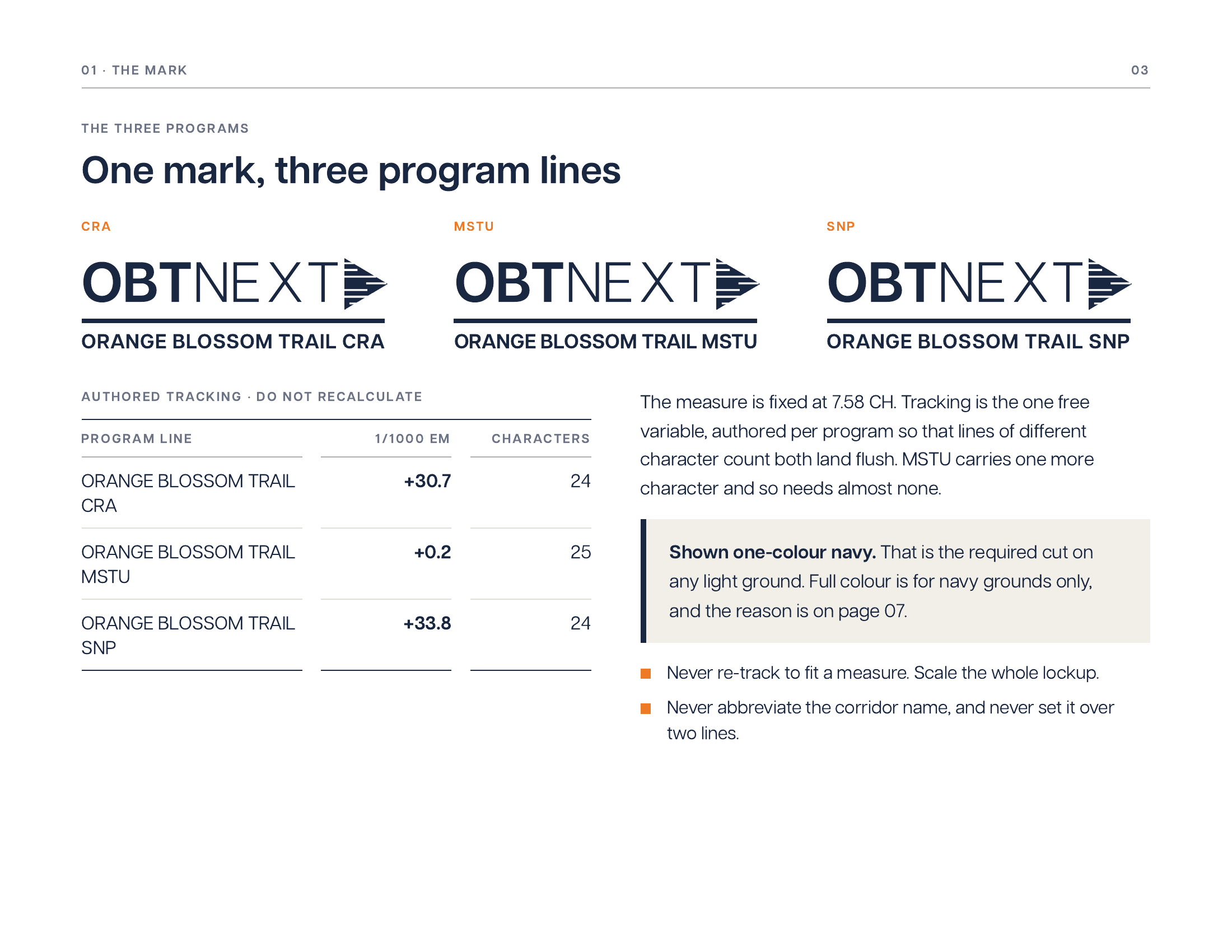
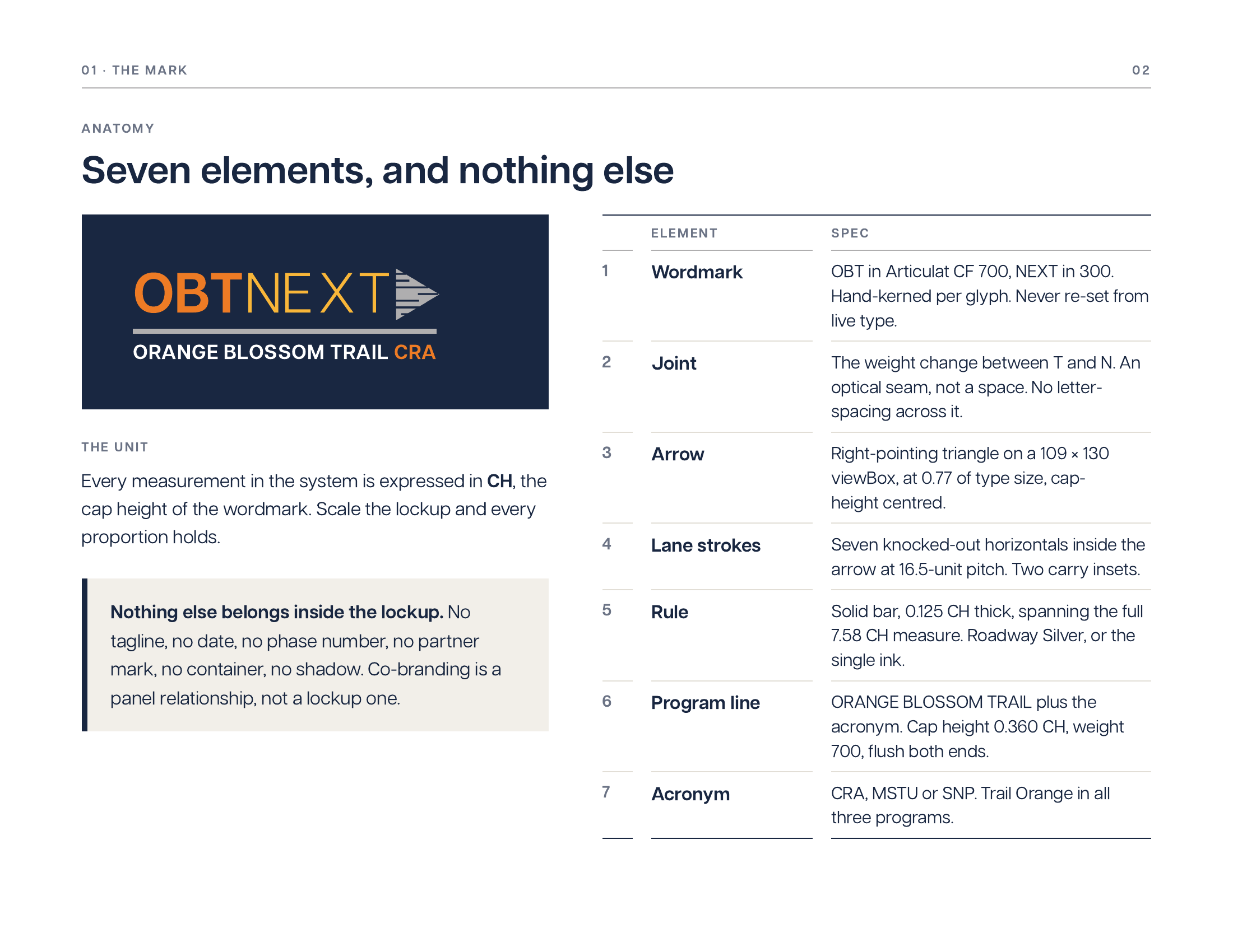
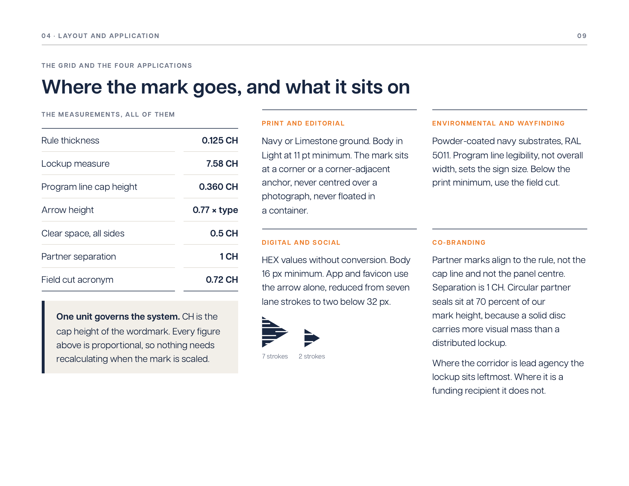
The master mark pairs the OBTNEXT wordmark with a lane-stroke arrow set at 0.77 of the type size, joined by a rule that spans both. Underneath sits the program line, the corridor name followed by the program acronym. That line is the only thing that changes between programs.
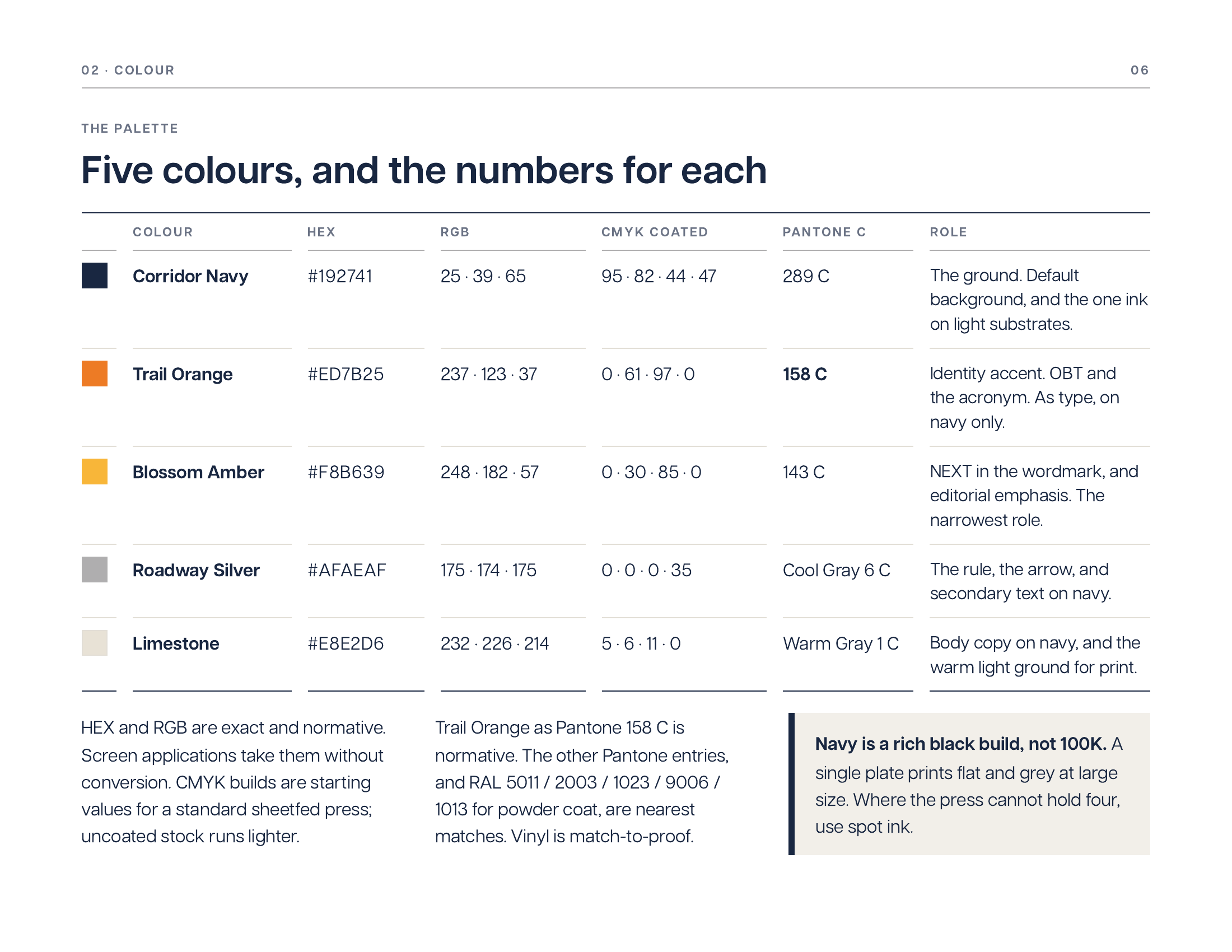
We tried the obvious alternative first and rejected it. Revision R2 distinguished the three programs by giving each acronym its own hue. In practice it read as three brands, which was the problem we were brought in to solve. R3 withdrew it. All three acronyms now set in Trail Orange, and the program line carries the distinction on its own.
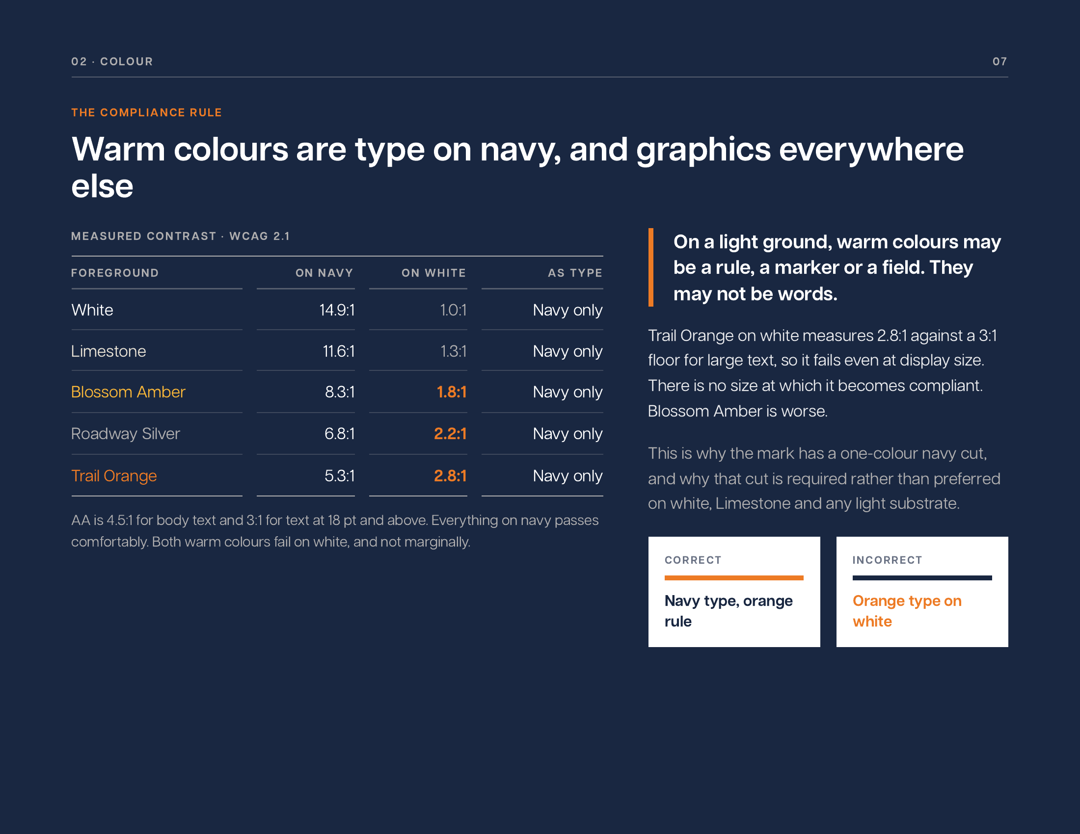
The manual runs 100 pages across ten chapters: authority and purpose, the logotype system, a five-colour palette with contrast specifications, typography in Articulat CF, the 0.125 CH proportional grid, photography standards, iconography and the lane-stroke motif, environmental and wayfinding signage, digital platforms and icon reduction, and co-branding with partner lockups.
Several decisions came out of testing rather than theory. Circular partner seals sit at 70 percent of the master mark's height, because a solid disc carries more visual mass than a distributed lockup and matching the heights makes the seal dominate. The three program lines track individually so each ends flush with the rule. The quick-reference card is 5.9 by 4.6 inches, sized for a clipboard and a glovebox rather than a wallet, because that is where field staff actually keep it.
The corridor has one mark, three program lockups, and a document that settles arguments before they start.
Export artboards are built at 600 by 250 pixels at authored size with one cap height of clear space on every side, so what ships is what was drawn. Nine files cover PNG, JPG, and SVG for each of the three programs at 2400 by 1000 pixels.
The manual carries an annual review cycle and a named brand steward, which makes it governance rather than a PDF that ages out in a drawer.
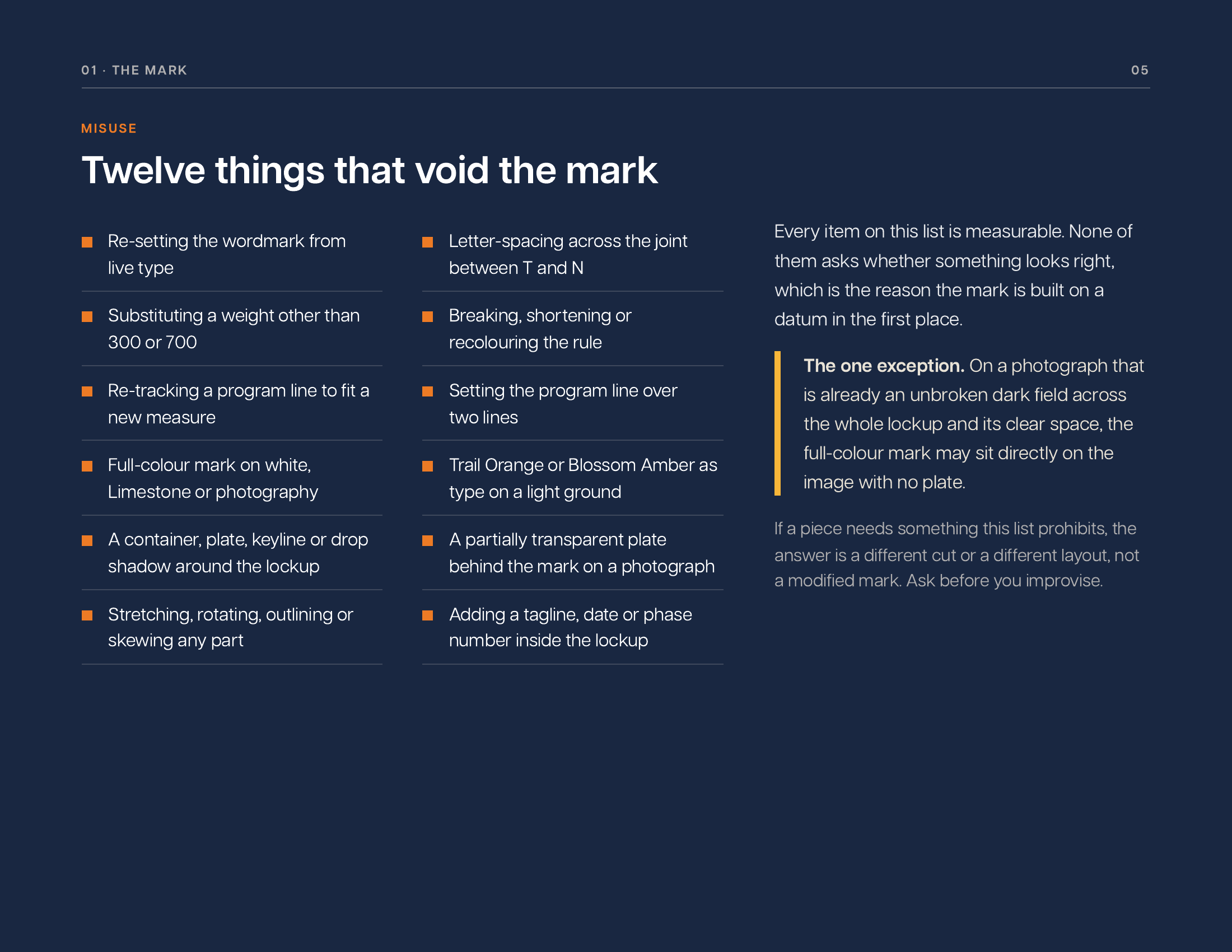
Download the OBTNEXT Brand Kit (PDF, 10 pages). It is the quick-reference edition drawn from the full standards manual: the mark, the three program lines, clear space and minimum size, misuse, the palette with contrast numbers, typography, the grid, and a nine-point check to run before artwork leaves your desk.
Tell us what you're working on and we'll take it from there.